Color universal design.

『Color Dimension.』を作るにあたって、5つの色を選ぶ必要がありました。
In order to create "Color Dimension.", I had to choose five colors.
5つの色はそれぞれ、互いのどの色と隣接しても容易に見分けられなければなりません。
また、個人的な目標として、あらゆる色覚特性でも同じ体験ができることを目指しました。
Each of the five colors had to be easily distinguishable from any other color adjacent to it.
Also, as a personal goal, I aimed to create the same experience for all color vision characteristics.
しかし、私は色覚特性の専門家ではありません。
そこで、color-blindness.comの色覚特性シミュレーターを使い、あらゆる色覚特性をシミュレートしました。
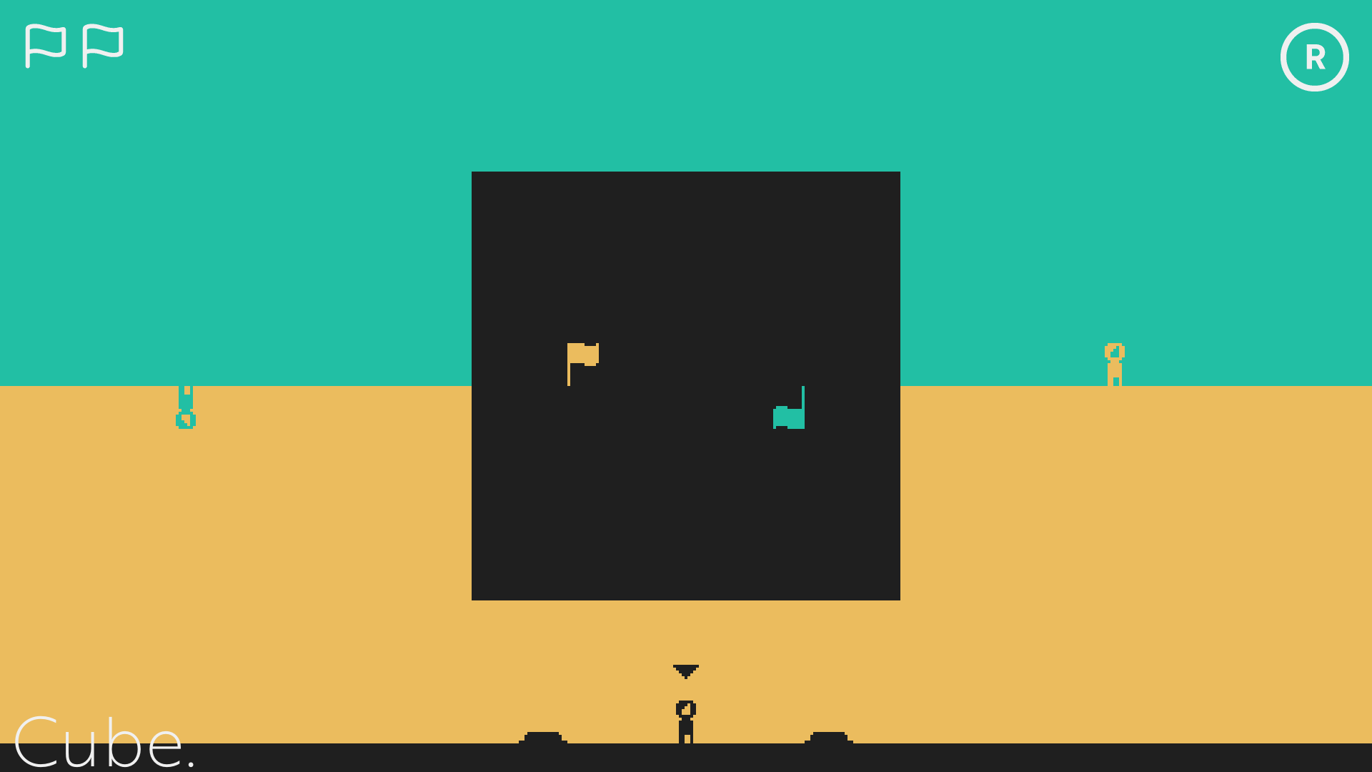
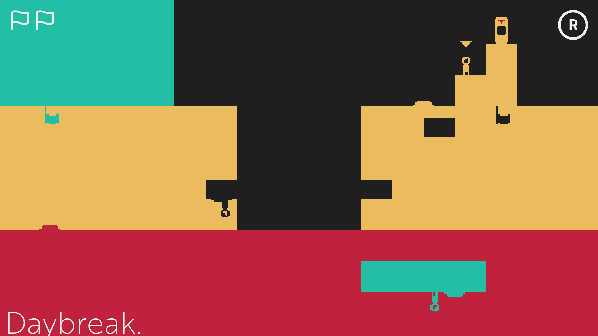
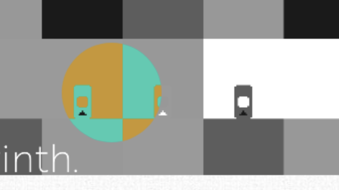
Jamで発表した、最初のバージョンで使用したのは、次の5色でした。
However, I am not an expert in color vision characteristics.
So I used the colorblindness simulator at color-blindness.com to simulate all color vision characteristics.
I used the following five colors in the first version presented at the Jam.
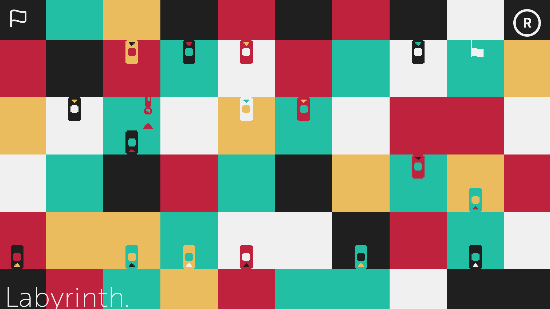
これらの色は、それほど悪いというわけではありませんが、まだ完璧ではありませんでした。
Monochromacy / Achromatopsiaで確認したとき、青色と黄色の区別がつかないのです。
These colors were not that bad, but they were still not perfect.
When I checked them with Monochromacy / Achromatopsia, I could not distinguish between blue and yellow.
しかし、Jamの締め切りも迫っていたため、この微調整については諦めていました。
できれば多くのステージを追加することに時間を費やしたかったからです。
However, I had to give up on this tweak because the deadline for Jam was looming.
I wanted to spend more time on adding more stages if possible.
Jamも終わり、次のプロジェクトまで少し時間ができました。やり残しを解決してみましょう。
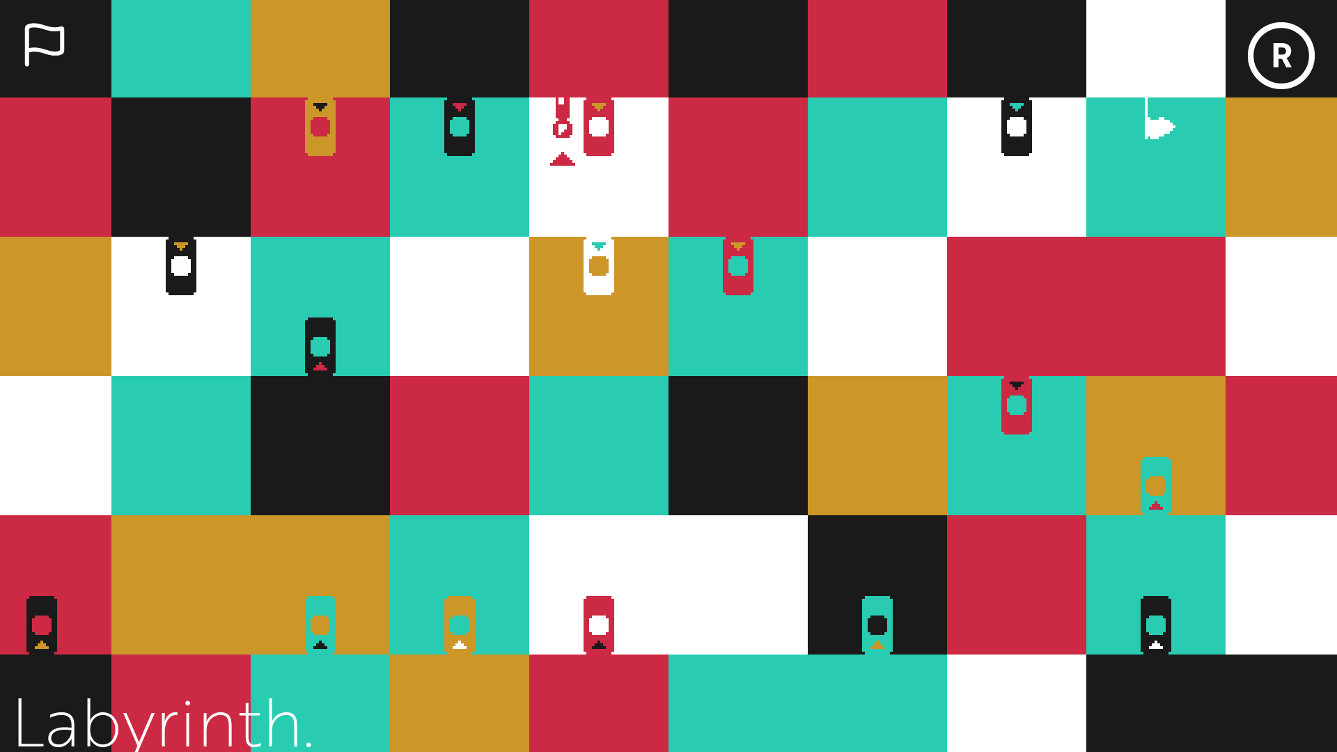
あらたなパレットでは、黄色の明度を高め、全体の彩度と明度を調節しています。
Now that Jam is over, I have some time before the next project. Let's try to solve the unfinished work.
In the new palette, I increased the brightness of the yellow and adjusted the overall saturation and lightness.

当初は黄色だけを調節すればよいかと考えましたが、黄色を明るくすると画面全体が明るくなりすぎ、また彩度も高くなりすぎてしまいます。
結果として、全ての色を調整することになりました。
Initially, I thought I would only need to adjust the yellow, but brightening the yellow would make the entire image too bright and the saturation too high.
As a result, I decided to adjust all the colors.
以下がColor Blindness Simulatorの結果です。
Here are the results of the Color Blindness Simulator.
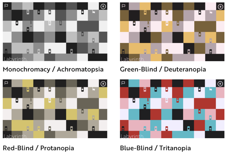
全ての結果で、5つの色が十分判別できるようです。
通常の色覚特性での画面も、眩しすぎず、落ち着いてパズルに集中できるのではないかと思います。
In all results, the five colors seem to be sufficiently distinguishable.
I think that the screen with normal color vision characteristics is not too bright, and I can concentrate on the puzzle calmly.
Leave a comment
Log in with itch.io to leave a comment.